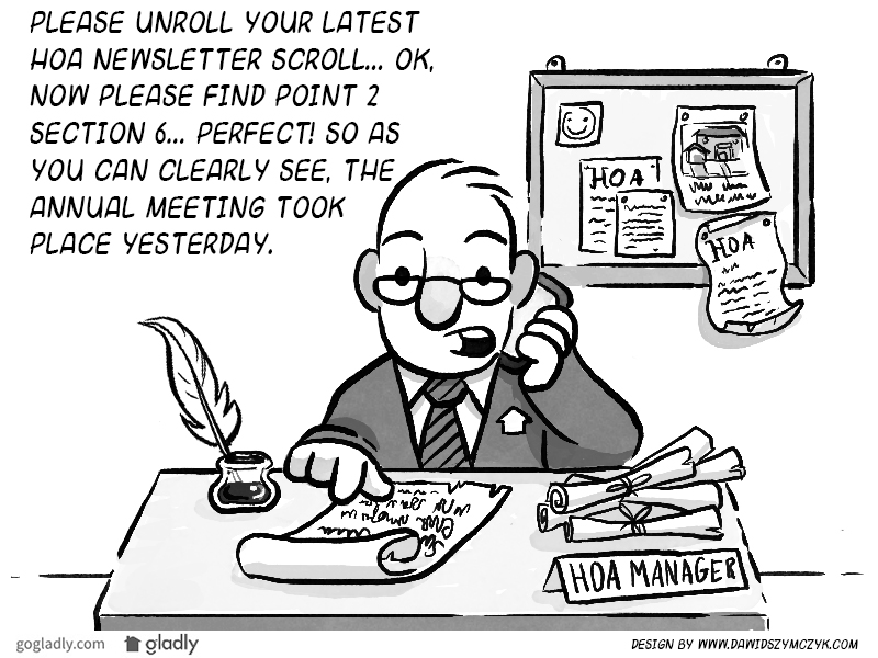
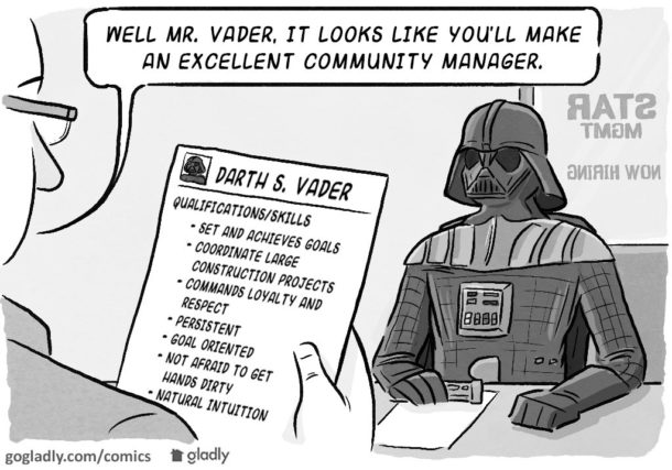
Ever wondered why nobody reads your HOA or condo newsletter? You’re not alone.
Not to worry! If you can go with the flow, you can have informed homeowners and an easier job to boot. Your budget — and the trees — will thank you.
Make it Easy
Today, easy means digital. Going digital is the only way to give your homeowners the quick and slick route to being informed. Easy is what they want, and it’s what they need from you.
- Social media
- Mobile apps
The vast majority of homeowners are like everyone else: busy and distracted. Information must be incredibly easy to get, and in bite-sized chunks. Asking a 32-year-old with a family and career to sit and read a newsletter is like nailing pudding to a wall. Not gonna happen.
Our lives cluttered enough with grocery ads and credit card offers. Nobody wishes they had more paper in their lives – so your newsletter gets lost in the shuffle or shuffled in with the recycling.
Picking up a smartphone is much easier than reading papers. Homeowners are far more likely to check email, text messages, and apps than they are to sit down with a newsletter. It’s basically effortless, making it the leading way to stay informed.
Make it Quick
And to make it quick, your information has got to be easy to skim.
Today, people don’t hunt for information – our attention spans are too short. People get smartphone notifications and scan social media. They quickly see the good stuff and automatically get what they need. It’s faster and more entertaining than any newsletter. The best part is, it’s right in front of them because they’re already using it. Nobody reads your newsletter because everything else is quick, mobile, and already there – just like you need to be.
Make it Engaging
Visual. Usable. Interesting. Three essential elements to keeping your homeowners engaged. Master all three and you’re practically bullet-proof. Fail at them and you’ll be back at square one.
Let’s start with visuals. We are inundated with stuff to look at. Facebook is full of photos and videos that catch the eye and grab our attention. Contrast that with most HOA newsletters, and you’ll see the problem. A paper newsletter, even with color photos, simply can’t compete with the draw of visually-engaging website. It’s much more alive and a darn sight more fun.
Usability is where visuals and convenience come together. Usability demands pleasing visuals that are nice to look at. But even pretty pictures can’t compensate for poor navigation, clutter, or a complicated interface. Make your HOA content beautiful and highly functional, and you’ll have usability nailed.
Content is king – even for your HOA. The content offered on your website has to be fun, interesting, and interactive (i.e. social). It should foster interaction between neighbors. You could even let them drive topics and discussions via feedback and surveys. And one more thing: never assume you know content homeowners want – it’s their HOA – ask them.
Informed homeowners = happy HOA.
We don’t have to tell you that a base of informed homeowners goes a long way to preventing problems. But it doesn’t matter how important the information is if it’s not delivered the right way. You’ve got to work with homeowners’ busy schedules, short attention span, and yes – apathetic tendencies.
Thankfully, your newsletter doesn’t have to be a newsletter at all. HOA communication can be quick, easy, and engaging – really.
Finally, did you know that we build websites that tackle all these problems for you?
- Walking the “Fine Line”: Imposing Fines in Your HOA - July 31, 2019
- HOA Meetings That Don’t Stink - January 23, 2019
- Setting Up Your HOA Record Keeping System - November 28, 2018


 Help
Help