In the day-to-day operations of your HOA, you probably don’t think about your HOA website too much. I mean, aren’t you busy enough? You’ve got money to manage, maintenance to follow up on, and complaints to respond to.
With all that other stuff, who has time to manage a website?
If you really don’t have time for a quality HOA website, you need to rethink your priorities. You’ve already got a to-do list longer than your arm. We get that. But no matter how hectic managing an HOA can be, one thing is for sure: your website still matters. Why?
Like any business entity, your website is your face to the world. When people are researching places to live, the first thing they do is go online for information. Your website is where those people will get the feel for what your community is all about, and what it might be like to live there.
If they can’t find what they want, pucker up. Because you can kiss those potential residents goodbye. And that’s sure to have a negative impact on property values.
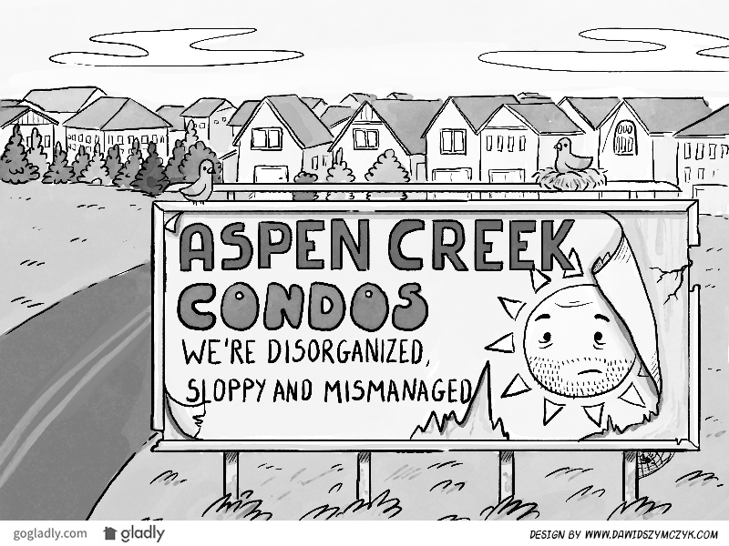
Think of your website as a billboard
Driving down the road, you see hundreds of billboards, all clamoring for your attention. The billboards that do their job well are the ones you remember. More importantly, they help you form an opinion about the company that put them there.
Your HOA website is essentially the same thing, except instead of flying down the freeway, your audience is actually looking for you. And that means it’s even more important that you make the right impression. If people took the time to seek out your community online, you’ve got to grab them with both hands.
Elements of an awesome HOA website
If you want your website to draw in new residents, you’ve got to make their visit a rewarding experience.
- Keep it relevant. If your site is full of fluff or clutter, it will be difficult to navigate and downright annoying.
- Keep it clear. Make sure your site puts the important information in obvious places. Sure, you know where everything is, but it’s your website. Make it downright easy to find everything. Never assume visitors are as web savvy as you are.
- Make it shine. So your Uncle Rico designed a “rad” site for his band? Good for him. You’re not looking for rad. You’re looking for robust, interactive, informative, and all around stunning. It doesn’t have to cost and arm and a leg if you know where to look. Quality pictures from a photographer with a real camera (not your phone) go a long way, too.
What does your website say about your community?
It should say things like organized. Happy. Safe. Well-managed. It should show well-manicured grounds and friendly residents who know — even like (!) — each other. Your website is of unparalleled importance to your HOA, and it should be handled with the same care as everything else you do as a manager. If you can manage that, you’re halfway home.
PSST: Read more about what makes a great HOA website here.
Also, did you know we offer the best HOA websites out there? Set up a test site today:
- Walking the “Fine Line”: Imposing Fines in Your HOA - July 31, 2019
- HOA Meetings That Don’t Stink - January 23, 2019
- Setting Up Your HOA Record Keeping System - November 28, 2018


 Help
Help
Good article. I have a question I am hoping someone with a little more knowledge and experience can answer for me. The President of our association basically took it upon himself to set up a website for our association and attached to the bottom of every page © 2015 (his company name). All Rights Reserved. It is my understanding that his company now owns the content, picture etc. The homeowners have been advised by the Board that we are to now use this site to contact them with any questions, comments etc. By attaching the © 2015 (his company name). All Rights Reserved.does this now mean his company owns all emails that flow back and forth between the homeowners and the Board. We are in the process of amending our CCR’s and from what I have read the plan is to have suggestions for changes and voting go through this website. If he were to move or leave the Board does all this communication go with him. As far as I know he was not paid nor was a contract ever drawn up. I am not happy with this website for many reasons (it is not very good) as well as what I have mentioned above.
Hello Gayle,
I’m sorry that I didn’t see this sooner. My guess is that since it’s been a few months you’ve already moved on. However, I’ll look into this and get back with you asap.
[…] to the members of the community! This can take many forms: regular issues of a newsletter, your community’s website, regular email blasts, flyers or text messages. The Board should work to find a method of […]
[…] a website. Many homeowners associations are behind the times and have not yet created their own HOA website, let alone registered for a HOA website domain name. Accordingly, when neighbors are not […]
[…] handle it. Period. By professionals, we mean people who know the HOA industry and what your community website needs to accomplish. Unless they specialize in building sites that engage homeowners and impress buyers, they […]