It’s true… the HOA industry has a problem — a bad, ugly, terrible, problem! — It’s not HOA boards run amok, or homeowner apathy. Nope… We have a community association website problem. It’s so bad we are having our fist ever Ugly Community Association Website Contest to shed some light on this problem. Nearly every day I talk to HOA board members and managers about their community website. The conversation usually goes something like this. “We just want a website that doesn’t look like it came out of the 90’s!”
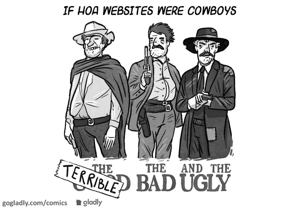
So why is it, the average community association website is so ugly, outdated, cluttered, and difficult to navigate? Here’s the good, the bad, and the ugly of community association websites.
The Good
The good news about your ugly website is that not very many people have seen it. It’s website 101 — an ugly, outdated, hard to find HOA website will get very little traffic, and even less return traffic. Okay, that’s not really good news, but I had to think of something.
In truth there are a few affordable, good websites out there. But many boards don’t see a “quality” website as a priority. As a result some communities don’t even bother with a website while others give the website little attention — simply knowing they have one is good enough for them.
The Bad
What makes a bad community association website? The modern consumer has a certain expectation when it comes to technology. The bar for quality is continually raised. I blame Google – with their clean simple interface that allows anyone with two thumbs to find almost anything they want online. Regardless whose fault it is, homeowners expect better and they won’t use it if it’s bad.
Here are the top three things that make a bad community website.
- Too much information: Quite often the HOA website become a repository for everything HOA. Sometimes it’s dumped on the homepage and other times in hidden in a link on a back page that even Sherlock Holmes couldn’t find. The website should contain current HOA news, the tools to contact the HOA and access essential information and documents.
- Outdated information: A good hoa website should be easy to update, with someone in charge of making sure the site is current. But HOA boards don’t always have a web expert to oversee the site, so, a good simple admin feature can be key to keeping your website updated.
- Difficult to navigate: A new page here, a link there, 25 buttons with sub menus. A website needs a simple structure that doesn’t change as new information is added. If a homeowner can’t find what they are looking for in just a few clicks, your site might be too difficult to navigate.
The Ugly
I get it, you’re a board member, not a web designer. But really, have you seen some of these websites!? I can’t stress this enough — your website should be simple. Your homeowners will spend more time on your site, and come back more often if your site is clean, simple and relatively attractive. Most homeowners visit their site to get the basic information, contact the HOA or make a payment. If you can give that to them in an organized site with a clean feel, readable text, and colors that don’t clash, your site will be much better than the average.
At Gladly we are having a little fun with this by holding our first ever “Ugly Community Association Website Contest”. It’s simple really, complete the form below with the address or screen shot of your ugly HOA website. We will narrow it down to 10 and then we will let you (our readers), determine the winner.
- Liar, Liar, Pants on Fire! Handling Misinformation in Your HOA - March 13, 2019
- Setting the Ground Rules for Neighbor Disputes - June 27, 2018
- HOA Board Responsibilities – It’s Not as Difficult as You’re Making It. - April 23, 2018

 Help
Help
Were can I go to see the Ugly websites from your contest?